Back in the day, I worked at a large corporate publishing company. As such companies do, we underwent a restructure. A big one. The place was invaded by management consultants. Our shiny, happy future was laid before us in a succession of slick presentations, which made extensive use of graphs and charts.
There were many, many graphs and charts, each one more confusing than the last. We had diagrams of new organizational structures. There were growth projections. There was a group of nested semicircles with arrows going off in various directions.
To this day I've no idea what that was about. There were, though, clearly people in the room who understood what was going on, to judge by the solemnly nodding heads. But an equal number were obviously as baffled as I was. Afterward, I heard the same responses over and over: "What does it mean?" and "What am I supposed to do now?"
Getting to Grips With Visual Literacy
Many of my confused co-workers likely shared my disadvantage – they lacked a strong visual imagination. I can cope with words. I write for a living, so that's just as well. But I find it hard to process graphical information into something that makes sense to me.
And when you're watching a presentation (or worse still, giving one), that's a major drawback. So, can you learn visual literacy? Better still, can you learn enough to use it to aid others' understanding?
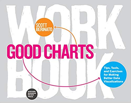
Scott Berinato thinks so. He's the author of "Good Charts" and the "Good Charts Workbook," and he's keen to tackle a few myths and misconceptions about how to make good "dataviz" (the short form of "data visualization"). The books are written for people who likely use dataviz on a regular basis, but they're just as useful for people like me, whose main contact with presentation graphics is as a consumer.
For a start, you don't need cutting-edge design skills or a degree in psychology. This is a pair of books anyone can pick up and use. Nor do you need to master the latest software: the books are "product neutral," mentioning drawing packages only in passing. And the Workbook's hands-on practical instructions are more useful than any software manual.
Understanding Your Chart's Purpose
What you do need is a strong sense of purpose. You need to understand what your graphic is trying to achieve, and on whose behalf. To do that, you have to ask yourself a couple of key questions. Are you trying to illustrate a concept, or is your graphic data-dependent? And are you stating facts about your subject, or exploring its possibilities?
It's answering these questions convincingly that underpins whether you'll produce a good chart, or good dataviz – not whether you're a design whiz, or even how deeply you understand the data yourself. It's perfectly possible to produce bad charts despite knowing your subject backward, as my former company's consultants showed me.
Making Better Charts and Graphs
The value of any piece of dataviz, says Berinato, depends entirely on its context. You may need it to inform, to stimulate debate, or to make a call to action. And you'll need to understand and use it differently depending on the role it's going to perform, who it's aimed at, and where you use it.
There's a lot of data coming at us these days. Sometimes its sheer volume and complexity can seem overwhelming. Being able to make sense of it is essential, and being able to use it to inform and mobilize others is just as important. Google's Six Principles for Designing Any Chart provides a good foundation to achieve this.
So a good chart isn't defined by how well it's drawn, or which bells-and-whistles software you've used to produce it (although skilful execution adds value). Crucially, dataviz isn't witchcraft or techie mumbo-jumbo. It's a skill you can – must – learn. And after reading "Good Charts" I'm prepared to believe that it's one even I can gain.
Download the "Good Charts" Book Insight
We review the best new business books and the tested classics in our monthly Book Insights, available in text or as 15-minute audio downloads.
So, if you're a Mind Tools premium club member or corporate user, download or stream our "Good Charts and Good Charts Workbook" Book Insight now.
Or, if you're not already signed up, join the Mind Tools Club and gain access to our 2,400+ resources, including 390+ Book Insights. For corporate membership, book a demo with one of our team.
What are your experiences of "dataviz" at work? Share your experiences in the Comments section, below.


